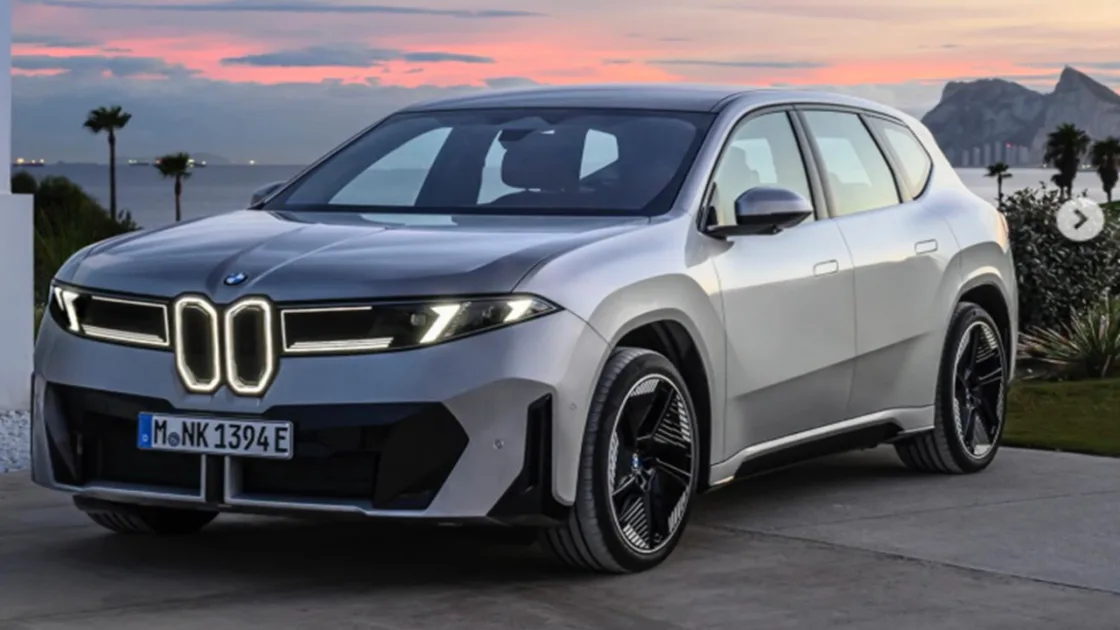
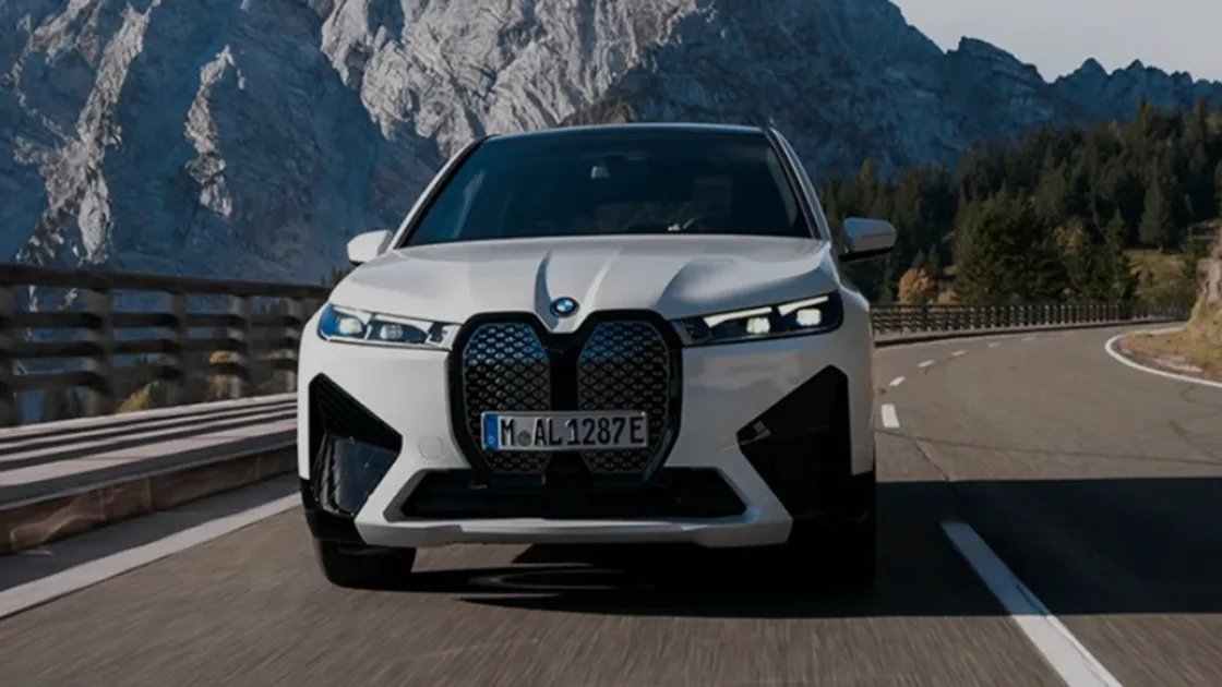
BMW Quietly Updates Its Iconic Roundel Logo with a matte finish and simplified design, signalling a new design era while preserving the brand’s historic blue-and-white identity, which made its premiere on the iX3 EV SUV.
BMW Quietly Updates Its Iconic Roundel Logo: The fundamentals remain the same: a circle with two blue and two white quadrants surrounded by a black ring bearing the three initials of Bayerische Motoren Werke, which translates to “Bavarian Motor Works.” The black surround now has a matte appearance instead of a glossy one, and the inner chrome ring has vanished. Even a BMW enthusiast would shrug at this evolution, which is likely to have given a graphic design team many sleepless nights.
This Is BMW’s New Logo: See The Changes Side-By-Side. Do you think it's better now? pic.twitter.com/F9H0Xx8nqF
— Prich X Daily (@prichxdaily) January 30, 2026
Key Details about BMW Quietly Updates Its Iconic Roundel Logo
| Aspect | Details |
| Change Type | Subtle logo redesign |
| Key Updates | Matte black ring, chrome removed |
| First Model | 2027 BMW iX3 |
| Design Direction | Minimalist, Neue Klasse era |
| Core Elements | Blue-and-white quadrants retained |
| Brand Risk | Careful evolution of iconic symbol |
| Future Plans | Careful evolution of an iconic symbol |
Also Read:- Tata Avinya: Flagship EV Strategy, Launch Timeline and Future Plans Explained
As first reported by BMW Blog, BMW’s basic blue-and-white logo will be updated for new models starting in February, beginning with the 2027 iX3. Actually, the brand’s well-known roundel has already been changed; you most likely missed it because it was so modest.
But tampering with a brand’s insignia requires caution, much like juggling nitroglycerine. The BMW roundel is so well-known that the BMW Car Club of America’s newsletter is named after it.
New Era
The current M3, for example, has drawn a lot of criticism, whether justified or not, depending on who you ask. BMW’s design department has undergone a period of growth. The brand, which may have reached its stylistic pinnacle with models like the E39 M5, E46 M3, and E31 850, seems to be returning to form with the new Neue Klasse design language. BMW’s designers are demonstrating that sometimes less is more with this revised logo. Although it’s a fairly small change, it has the potential to be a significant sea change.
A History
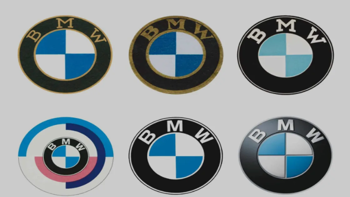
The blue-and-white component of BMW’s symbol is often associated with an aeroplane propeller because of an early advertising campaign. Although the detail is heraldic in origin rather than aviation-related, the company did initially manufacture inline-sixes for aircraft. Although it has evolved slightly over time—the initial badges had gold lettering—the fundamental components have remained constant since 1953.
The BMW roundel’s history dates back over a century, to the early 1920s, when two aircraft manufacturers were amalgamated. The Rapp Motorenwerke logo originally featured a horse head on a plinth, but was later changed to a light blue-and-white checkerboard pattern meant to resemble the official Bavarian flag, which was derived from the House of Wittelsbach’s coat of arms. If you’re interested in royal ancestry, you should know that the Wittelsbach line extends from Bavaria in the tenth century to the current King Charles III. Beginning in the 1970s, M Performance models received their own version of this badge, and an update is also planned for that badge. That should also be fairly subtle, though, based on how iterative this new mainstream BMW badge is. Compare that to BMW’s previous blatant display of M emblems all over an X1.